I Love The View : Art Project Q2
I'm The reason I wrote I created this has something to do with difference and dedication. I did this because i wanted to do something that will remind me of someone else and have it remind them of me. Plus I’ve never worked with clay before so it’s a new experience that i can say i now have.

It turned out great and exactly how i pictured when i changed my idea to what it is now. I was really hoping to make some realistic and relatable but also dark and with a touch of emotion.
I feel like if the person understands what it symbolizes then they will get the message of a dark love. Just by looking the viewer may see a nice soft picture of exactly what it is, a mountain and a tree. I think I Achieved my initial goal of creating 3 pieces.
My Past work relates to my current due to my imagination not changing only my inspirations Have. As an artist I try to make my work more divers to attract a different crowd and a different emotion .
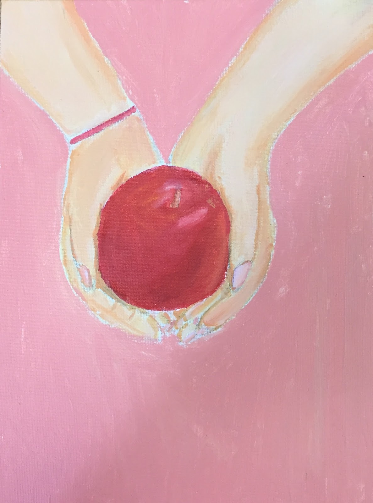
Richard orlinski had created this still life sculptured piece that is almost like mine except it is of an animal meanwhile mine is of an object. It seems to me that it may also have been made of clay.
For my piece, First I Had to make the decision of using clay. At a few failed attempts i initially used a glove, then used news paper and glue to form a mold around my hand, then let it dry. Since i got impatient i didn’t let it dry fully and used tape to do the mold but forgot that i needed to take my hand out of the mold. So i cut a slit down the middle took my hand out and was left with this deformed hand mold. I compromised and just used clay to give it its current form. It took a lot of clay and water to make it hard and think like a real hand. After that was done, I got a plank and hammered two nails into it to hold the hand up in place and then took clay and covered the nails so it was like they were never there. After that i covered the plank in clay and painted it making a river, it continuously cracked but i kept going over it until it got tired of me and decided not to crack anymore. I Painted all of it and decided i needed a tree which i alo made out of clay and painted. There was no inspiration for this piece i improvised the whole thing because i wanted it to truly be original which is probably why i ran into so many mistakes.
I put a piece of me into the piece. My mom is deaf and the mountain is in the shape of the sign “i love you” which was a big piece of the whole thing.
It would definitely bring awareness and for those who can relate to it will feel inspired and honored to be noticed. I think it also just says “i love you” to everyone that see it’s because it is a strong word and sign for those who speak the language.
I feel like by having a certain technique it makes the piece original and carefully thought out. I don’t think that an artist should have a certain technique though because it puts a limit on his experience.
A technique i learned was to compromise, because it won't turn out how you think it will so whats plan B?
Overall i feel like this artwork is just a chunk of me now and me in the future, hopefully my skills just continue to get better and my still life will be even more complex to the point where maybe i wouldn't be able to recreate it even myself. That is my goal, to have done something so well that there's absolutely no chance of me creating that piece.
