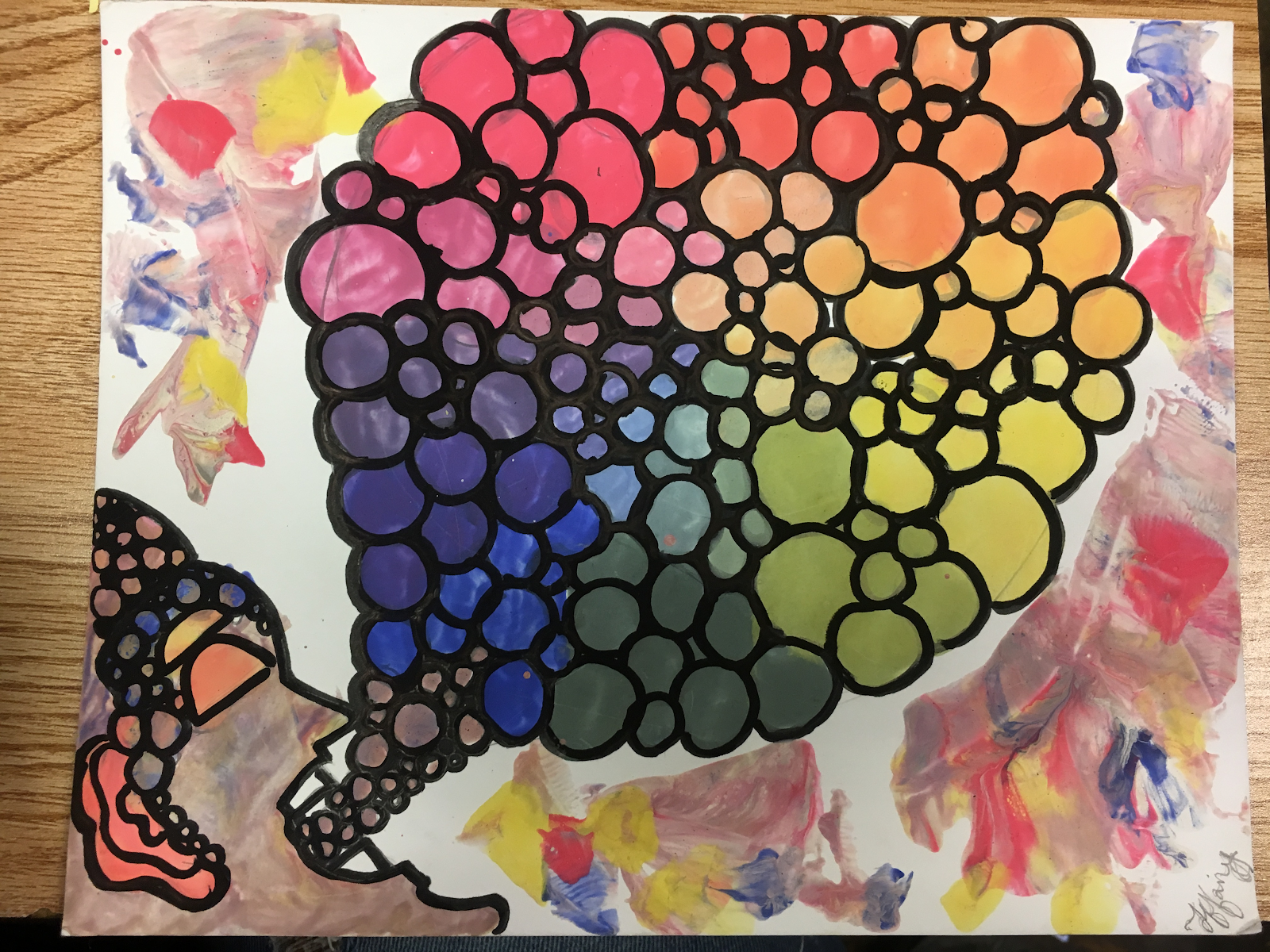
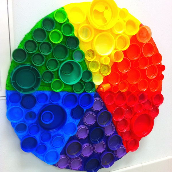
• Log In
  • Log In
Science Leadership Academy @ Beeber
Science Leadership Academy @ Beeber Learn · Create · Lead
  • Students
    • Hand in Hand - Markus C
    • Mark's Natural Disasters 101 For Idots
    • SLA Portal
  • Parents
    • About SLA Beeber
  • Calendar

Art 2 · Hertz · d1 Public Feed

Create a Post

Color Wheel

Posted by Andre Thomas in Art 2 · Hertz · d1 on Thursday, November 3, 2016 at 10:04 am

Athomas
Athomas

I like abstract art and lines/curves are very easy to work with but can be very elaborate if done right. I wanted to paint a sequence that blends itself into the other colors over time, I did this so the audience can see how subtle and then extreme the transitions of colors can be. I didn’t expect any particular reaction based upon the vision I went with but I expect people to just say their honest opinion of it as they have up until now. This piece has my signature wavy look to it which reminds me of many of my past works.

I always tend to go more in the abstract direction because I like the style more than realism and the end result is more of my liking. This relates to the fairly recent artists that have moved away from the realism approach that was originally established, leaving us at a time of preference. My personal preference is of course abstract which is displayed in my pieces and it fits into the more obscure art styles that have arose lately. Although I like abstract art a lot my inspiration was just the idea of abstract as a whole, no specific works were drawn from.

I always liked the art that leaves you thinking without much to go on so I wanted to recreate that. I learned through this project that easing up on my brush leaves more control even though the entire process goes a little slower sometimes as a result. All of the paint has to be done going in the same direction so that colors do not clash or mess up how the colors look on the canvas, so it took long compared to how quickly I usually finish a piece.

Basically this piece was just my abstract take on the color wheel. It took me awhile to get everything aligned right, but I’m proud of the end result.


Be the first to comment.

Color Wheel Project

Posted by Adam Bennett in Art 2 · Hertz · d1 on Thursday, November 3, 2016 at 9:50 am

I created this work because I wanted to make a spider web for the color wheel aspect of the project, but as I looked I saw others had the same idea. Instead, I made something similar, but it’s like a web/wheel instead of a full web. My vision for the work was for it to have multiple wheels that had the primary, secondary, tertiary, and tint each in their own wheel. Also, I wanted it to be very straight and proportional , like I wanted the colors match for each wheel. For anyone who sees the project, I want them to look at it and not see the mistakes right away, but admire what it is and what it could be.

I haven’t really made any art in my life because I don’t consider myself an artist, but I can relate this to my artwork back in 9th grade. In 9th grade, I drew a shoe which was based off of the shoe I was wearing at the moment. Although the art piece lacked color, it reflects how I draw and in this color wheel project there have been improvements in my art and creativity. In today’s art, there are similar aspects where the tertiary, primary, and secondary colors are used and it is similar to how it is used in my project. The color wheel also gives the basic for color art in general. Art is created with different and various colors throughout the years, so the color wheel brings out that history of the basics in color art. This aspect reminds me of the value scale I did in 9th grade, with the different shades of black and it gets lighter the farther you to the point of white. That project was the first thing that came to mind when I thought of the color wheel. This link was my influence for the project, but I don’t have a specific artist that influences me today.

http://www.jalapenopaintwerx.com/blog/bid/209865/Paint-Color-Ideas-for-the-Home-Jalapeno-Paint-Werx The technique I used to make sure the wheel had 24 places was I added the tint before the primary color of that tertiary. So, if I had a red-orange space on the wheel then the next space above would be half tint and half primary color which was red used to make the tertiary.

In all, the project was one of my best pieces of art that I created. Although I wasn’t able to make my vision into a reality, I believe my project draws from my own idea of a color wheel that looks unique and different from any other. I don’t consider myself an artist in terms of drawing, but there isn’t a such thing as great art given that there are so many interpretations of a good art piece. I made my color wheel knowing this aspect of there is no good art, I was able to freely paint.


IMG_1371
IMG_1371
Be the first to comment.

My Color Wheel Project

Posted by Imani Horne in Art 2 · Hertz · d1 on Thursday, November 3, 2016 at 9:50 am

I have created this piece of artwork because I love colors and I felt like if they all came together as a closing light it would look nice. I also created this because I never really paint and I never do creative things so I thought that If i did this it would change my experience in making an art piece.  My overall vision of my work is simple and beauty. I know that there are other paintings out there that are better than mines but coming from me, a person who doesn’t really like to do stuff like this it is nice. I am very proud that I was able to create something that pops out at you.
People who see my artwork won’t really be excited about it. It’s a simple art piece with lines and color. There may be some people who say that it is nice and other who think not. My work would fit probably in the middle. I know that people are more creative than me so there's would be at the top and I did better than other so I would rank myself to be in the middle. My art work fits in with the history of art. It fits in with the color systems. I did colors, colors in between and over the top colors.  Which was basically the color system. They played with colors and made many more colors in comparison to me.
Inspiration for my art work… I would have to say, is the art piece Ms. Hertz has on the wall. It’s a girl with her umbrella that is colorful all around. That was inspiration. I felt like I wanted to do mines bigger and better. Also art piece that I found online inspired me. www.colourlovers.com. My work would fit nice in an art exhibition. I would go with the art work that goes circular with lines. Similar to my art piece.  My work relates to others because we all used the same colors. We just all have different minds. Someone else's mind is more creative than mines. People who see my artwork won’t really be excited about it. It’s a simple art piece with lines in color. There may be some people who say that it is nice and other who think not.
Knowing what your doing is the most important technique. If you know what you're doing you’ll be on track and in the right direction. If not you’ll probably do good but you won’t know the ending. It’s like reading only the first page of a book and stopping…. You’ll never know the outcome. You should always do what you're most familiar with. It’s cool to think outside the box but make sure you're going to go through with your plan. Also staying focused and true to your artwork is a good technique that I learned in the process.
received_1783517588533027
Be the first to comment.

Color wheel By Tiffany Irick

Posted by Tiffany Irick in Art 2 · Hertz · d1 on Thursday, November 3, 2016 at 9:28 am

https://docs.google.com/a/slabeeber.org/document/d/16odtRKADgqS_i_GVY2AUf1hmQuTT75Dn3eg_hzZec8g/edit?usp=sharing

I chose to create my work because I wanted to be different from a lot of other people. I seen lots of eyes for the color wheel and that was exactly what I didn't want to do. I choose something that was “loud” to me. My painting was of a man who was screaming. Hile scream he was blowing out colorful bubbles. I want to something I spoke to everyone and I just spoke quietly  but spoke loudly. I expect to get nice reactions from our My audience saying if it was different. My current work relates to my previous work because I like to switch it up. It is very colorful and it speaks loud.  I believe all my previous work was  very colorful and it spoke out loudly.  my work has never been boring. The word fits in with the current contemporary or because people are still  painting now.  this is Art that's been and still is being created. My work fits in with the history of art practice by painting. The oldest painting known to man is about  40000 years ago. People are  painting. My work fits into the group exhibition or series of projects I have done by color choice. my work has color pop in common.  my work varies with different shades of color.  Leonid Afremov is one artist that I look up to when I think about color. His work is so bright and vibrant. It is almost like you can see every color in the world. My work can lead to a portfolio of color. I can create more work or painting that express a story with colors. To make my work vibrate i  had to go over my colors more than once. I used that technique so my colors would pop out and stand out more. I haven't learned anything new this quarter by doing this project.  During this quarter  created a color wheel that was different from the others. A color wheel that spoke loudly and clear. I believe if any my work was more loud like this color wheel I can really have a nice and bright collection. This quarter I have realized that color can bring a painting more to life than ever.

Sources and inspiration for your images.
http://hative.com/wp-content/uploads/2014/12/color-wheel/9-creative-color-wheel-project-ideas.jpg
Be the first to comment.

Color Wheel

Posted by Kashia Bumpess in Art 2 · Hertz · d1 on Wednesday, November 2, 2016 at 11:43 pm

kashia artwork 001
kashia artwork 001

My overall vision for this assignment was to create something colorful and pretty. I expect

that my audience will like how visually appealing and creative my color wheel is. I think they will react in a positive way. I did a colorwheel last year. The one I did this year I felt that it wasn’t an improvement from last year. I was rushing this one and didn’t really put a lot of effort into it than my previous one.  

It fit with the current contemporary art because the art nowadays is always so creative

and appealing and I think my color wheel has those same qualities. My art fits in with the history of art practice because a lot of art I saw in my lifetime was multimedia art and I think my art is that to because I used sharpies paint coloring pencils and markers. My work fits in with the series of projects I have done because they were all creative and colorful. My artwork relates to other artist because artist try to create something that is eye catching and I think I was trying to do that with my color wheel. A new technique that I learned is easily get your design on the board and you can do this by using the blue tracing paper.

In this project I felt that artwork is  colorful and pretty. Also I think it is visually appealing

and creative. I hope to attract a lot of people with my artwork. I may not have put all my effort into it like I did with my last color wheel but I did try to make it have a great outcome that people will like. I chose the flower design because I flowers are pretty and a lot of people like flowers.
Be the first to comment.

Color Wheel Project

Posted by Sakura Seals in Art 2 · Hertz · d1 on Wednesday, November 2, 2016 at 2:34 pm

sakura

When thinking about doing this project I decided to make my color wheel out of a spider web because, I really like the design of the spider web. I also didn’t want to do a basic color wheel because other people were doing it.  My overall vision was to create a huge spider web with different sections to show the color wheel.  I expect my audience to see the difference between the tints and original colors. My current work relates to this color wheel project because in middle school I had did something similar to the color wheel. The only thing that was different about it was  that the paper we had to color had numbers on it that corresponding with the color.I think my work relates a little bit to contemporary art because when I looked up what it was I saw how the artwork was colorful and eye catching.


I think my color wheel would fit in with contemporary art because of how colorful it is. I don’t think my art work fits with anything really because, I never did anything like this before. But if it did fit into a category it would be contemporary art.  My inspiration came from google because I was looking up different ideas I could use to do a color wheel than a basic wheel .I wasn’t really influenced by any artist. I guess I was influenced by the different art I saw on google for the color wheel examples. A certain technique I used in my project was using a sharpie to go over the lines. I realized when doing this it made my artwork more defined. To me personally it made the colors really pop more. I learned that you can use only three primary colors to create so many other colors know as your secondary colors. I am very proud about the artwork I created because it is something new and I think it turned out really good.
Be the first to comment.

Color wheel project

Posted by Cyrus Foster in Art 2 · Hertz · d1 on Tuesday, November 1, 2016 at 8:10 pm

Cyrus Foster

Art

       Artist Statement


I chose to draw what I did after looking through a few examples. I was going to draw a circle at first but I wanted to do something more complicated. I have a dog/wolf character I draw and I thought the many colors of the color wheel would look nice with it. The character is drawn in 3-D so I planned to color the main parts with the color wheel and color the shaded parts black. I made it in a way that you wouldn’t exactly relate the coloring to the color wheel unless you’re really thinking about it. I wanted the drawing to look like it’s naturally colored so the color wheel won't be forced into the picture.

My current work is very similar to all of my other work. I am well known in the local street art community for my character that I drew. I notice that in the current times street art is becoming very recognized and well known. The type of street art I focus on tends to take a basic character and exaggerated it with emotions, actions, and colors in many different ways. The color wheel was made and used to help artists with colors. Many of my pieces consists of the same character in different settings showing different emotions and colors. I was basically inspired by myself to draw this picture the way I did.

The main focus was to color the character in with the color wheel and leave the 3-D parts for the black. I bolded the outline to make it stand out and I did the background red and black and left the middle white to contrast.  


FullSizeRender (5)
FullSizeRender (5)
Be the first to comment.

What's your future?

Posted by Abdulomar Tucker in Art 2 · Hertz · d1 on Monday, October 31, 2016 at 2:52 pm

Abdulomar Tucker

Thu,Oct 20th,2016  

Color Wheel Project         

             What’s your Future?


               I created this project because I didn’t want to just make my project a little  different.  I didn’t just want to have a color wheel , so I started thinking of ways to incorporate the color wheel into a overall picture. I went from trying to use inspiration from a show to nothing. Until one day it hit me. Out of nowhere, I thought about using a fortune teller. This way I would be able to incorporate the color wheel in a cool way. Because of the cool incorporation with the fortune teller and the color wheel being multi-purposeful , I believe the audience will love it. I think they would commend me for my vision and creativeness.

Similar to my other works. I like to make my work creative, deep and making  it something that you have to make  the most out of it. Another reason, why it’s similar to my other works is  if it were thrown into a pile of my other works it wouldn’t stick out in a negative .I think my work also compares to contemporary works in modern society because I took some 21st century influence. I also gave my work and message I constantly think about which I titled the painting. This fits in with history because it’s contemporary art. Making it fit in a unique category.  I used pictures from this site to draw inspiration : "Love Fortune Telling." Love Fortune Telling. N.p., n.d. Web. 31 Oct. 2016. An artist that influences me is James Patterson. He fits into my work a lot because we give our work a realistic comic book feel. Our work looks like it could be in a comic book. A technique I find useful and mimic is the number of drafts he would make of one work. He would remake something as many as 9 times to really work it over. I never did this before learning about him. It makes the work look really clean.


IMG_1299
IMG_1299
Be the first to comment.

Color wheel: Dream Catcher Edition

Posted by Dior Seidle in Art 2 · Hertz · d1 on Monday, October 31, 2016 at 2:51 pm

The reason why I decided to draw a dreamcatcher because they are used induce positive dreams and push away all negative dreams away. I enjoy having peaceful sleep and positive dreams because then I’m able to have an enjoyable next day. Overall I think I did this very well, but I do believe that this is good artwork, but I could have did a little better on the background. I expect my audience to notice the primary, secondary, tertiary and tints as well as the object that I drew. They should see how I worked the different colors into the dream catcher. There  is nothing right now that relates to this image, but I really enjoy the idea of me doing something new that I haven’t done before. I don’t think this piece really fits with contemporary art, but it could possible fit a little due to the colors.It can fit with the history of art because there was always color and color is still used in this time period as it has always been today.

It doesn’t really fit with other works that I have did that much other than the colors that is done, but I never really drew something like this before.I looked over a few pictures off of google to get an idea, but nothing more. I already had an idea of it honestly when I was thinking of exceeding expectations for this project.I honestly wasn’t influenced by anyone for this project, but I was simply influenced by exceeding expectations by finding other circular things to use as a color wheel for myself.I find it important to always have the primary colors present when painting because you can make any color as long as you have those three colors on your palette.I learned that I don’t always have to buy a lot of paint in order to create new colors for a picture that  I’m painting at the time.
Screenshot 2016-11-07 at 3.05.11 PM
Be the first to comment.

Quarter 1 color wheel project

Posted by Nathan Lewis in Art 2 · Hertz · d1 on Monday, October 31, 2016 at 2:43 pm

Nathan Lewis

Art 2

Artist statement

When I started thinking of this project I wanted to do something different from just a regular color wheel, so I went on google to see different ideas. I saw a color wheel on google and I liked it so I did that for my project. I did that because I thought it was cool how it had the colors in the leaves. Even though this is not my original piece I added my own touch to it. What I did was; I did a tint from the leaves going down to the root and I also added a background of different colors all splashed around in an unorganized way.

I think this piece was ok, it could’ve been better if I made it bigger so that the shade could show some more, but when people look at this I want them to have their own interpretation of it and I also wants it to show people to think outside of box and because of the background I want it to be seen as also a very vibrant piece of Art which reminds me a lot of when i first started drawing and coloring, I used to always use a lot of colors and I think that represents the kind of person that I am.

FullSizeRender
FullSizeRender
Be the first to comment.
103 posts:
← Prev
  1. 1
  2. 2
  3. 3
  4. 4
  5. 5
  6. 6
  7. 7
  8. 8
  9. 9
  10. 10
  11. 11
Next →
RSS

ART_2-002

Term
2016-17

Other Websites

Launch Canvas

Blog Tags

  • Art 2 1
  • Final submission. 1

Teacher

  • Mary Hertz
Science Leadership Academy @ Beeber · 5925 Malvern Ave · Philadelphia, PA 19131 · Ph: 215-400-7270 Fax: 215-400-7271
×

Log In